https://www.udemy.com/
udemy.com is an online learning platform. Aimed at the people who would like to improve job-related skills. Sometimes, I could buy a well-designed course at just US$9.9.
Why do I think udemy.com is a well-designed website?
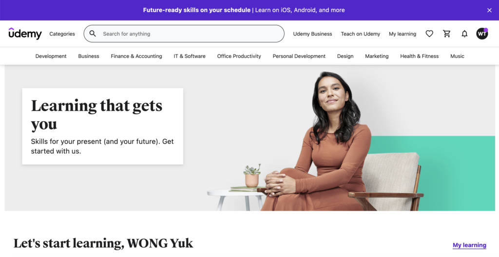
Firstly, the design meets the expectations of users, which means that easy to access what I want, e.g. “My Learning” at the top of the right, the search bar at the top of the left, etc
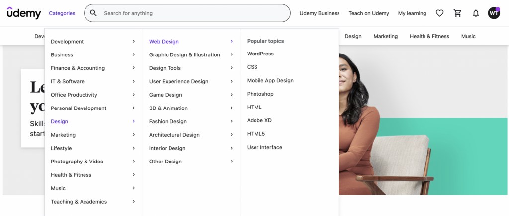
Second, even they provide various types of courses, it is still easy to discover the categories.
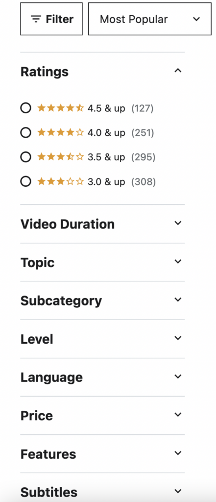
The categories for users to filter the appropriate courses are also well-designed. For example, we can filter the courses which are free of charge at “Price”.

On the page of “HTML5”, we could see the recommendations of courses everywhere. It really makes me feel easy to find what I want. This is because they will tell me “HTML5 students also learn”, which helps me to discover more to meet my needs.
https://www.apple.com/
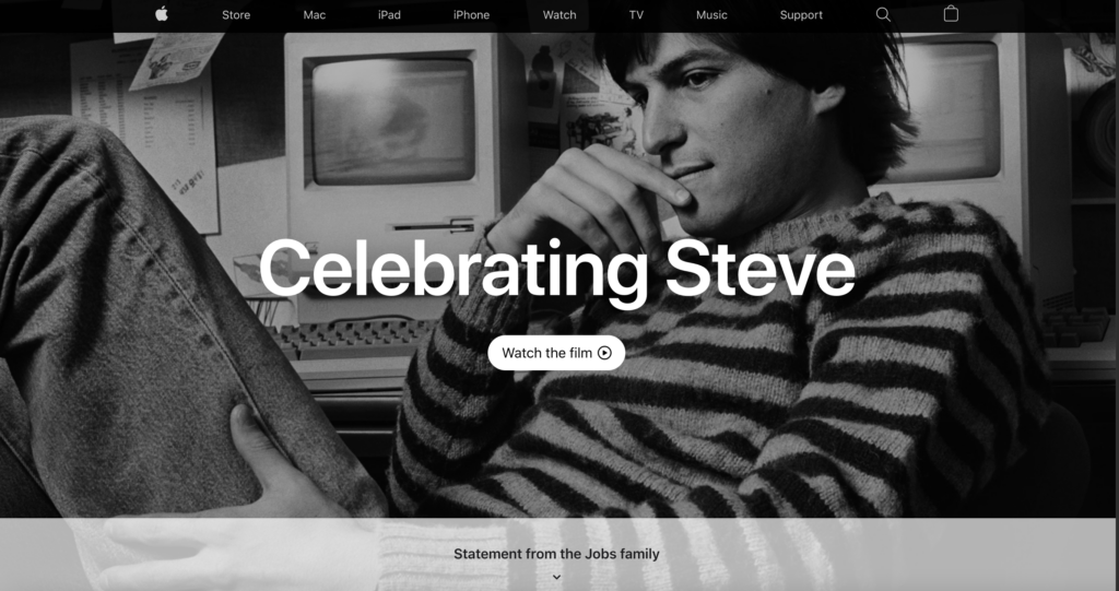
Before I had an idea to be a Web designer, I did think that this is the best website I have ever visited, and I still have the same thought.
The main reason is I love the effects when I scroll down on every product page. I cannot find any other websites which have the same effect.
Also, even apple.com has massive information, but all the information on their website is up-to-date and correct. They could update the content immediately after Apple Event.
They make me would like to know how many people are working and how they work.
https://yusukefukunaga.com/
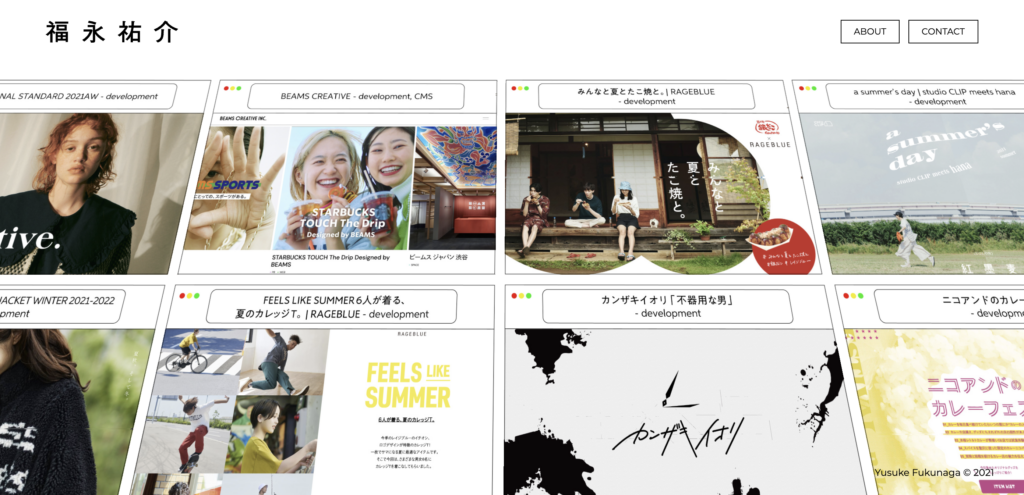
This is a portfolio website of a Japanese web designer, Yusuke Fukunaga. We can see the projects that he designed on the front page. The presentation is very dynamic and eye-catching. It makes the readers believe in his talents and his works.