Constant learning and practice are essential for us newbies who want to get into web design. After just two months, the knowledge and skills that I can apply have been greatly improved.
Links for two versions of Small Business Website: Original / Revisited
An analysis of the original site
The original site is a responsive website made by the Desktop First approach. At that time, I thought the design of the layout on the desktop viewpoint could be more colourful, and it would be better to start from a complex layout. However, it was a nightmare when using Media Query to make it responsive.
To ensure a good look and feel from the large screen to the small screen, there are ten breakpoints from 1380px to 430px. The result is more than double the original fix-width code. It took me 15 hours to adjust the layout as a rough estimate. But the nightmare isn’t over yet, as checking and maintenance are still to come.
When writing CSS code, I gave not enough thought to how to more efficiently fit elements into RWD. Especially blocks containing images, absolute values and {position: absolute;} have to be adjusted several times.
Since the original design was designed based on the target customer group and brand style, no significant changes have been made in the design. The modern style layout and typeface are for attracting young customers, which is one of the purposes of making this page. The colour palette is to create a high-quality feel, and the logo is also suitable for printing on stickers or packaging bags.
Visually, I have tried my best to make it comfortable for reading. For example, the text and the background maintain high contrast, and the image selection appears consistent. All images are optimised for visual and accessing speed, such as cropping and compressing. Maintaining the clarity, but the sizes of most image files are controlled to be below 100kb. But it does not seem to be friendly enough for users who use mobile phones and mobile data.
In addition, the 59-year-old shop owner has no habit of using social media, and there is no one to help, so I did not force him to open any social media. It doesn’t work if it hasn’t been updated for a long time.
Although there are no significant errors in terms of HTML semantics, there is still room for improvement. Accessibility can be enhanced if more specific tags are used. In addition, the alternate text of images can also be optimised to improve accessibility. For example, the figure caption has already written “Brownie” for the brownie image. So, in the alternate text, it can be described in more detail as Double Chocolate Brownie.
A summary of improvements
The revisited version has not changed much in visual design, mainly in technical improvement and optimisation in various aspects.
Mobile-First approach
Although the previous version was written to be responsive, I still felt it was worth rewriting the viewport from small size and was glad to have this try. Because there are only four main breakpoints in the reworked version (plus three breakpoints with minor tweaks), the code written in the media query is significantly reduced by about 60%.
In addition to feeling that mobile-first design is easier to adapt design to the large viewport, when modifying the HTML and rewriting the CSS, it is necessary to consider in advance if the deformation of the elements can be reduced. For example, the width of a block or image is set to a relative value, plus an absolute value of max-width or min-width. This reduces the need for later adjustments.
Application of PHP
Even for a small four-page website, it is still necessary to use PHP to make it a dynamic website. In addition to feeling its power, it is also easy to maintain.
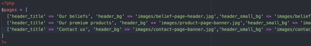
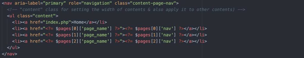
Multidimensional array & Includes
Except for the home page, the headers of the content pages are all the same design. So I try to write the data to an array and then give each page a number in a sequence. Then in the appropriate position in the HTML code, print (echo) the required information. Finally, include the include pages in the desired position.

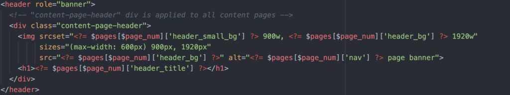

I was skeptical of it when making the first page (because I had to write more code than usual), but when the second and third pages were made instantly. I apologize for my skepticism.
When I successfully applied them in the <header>, then also use them in the <head>, <nav> and <footer>.
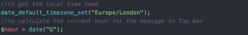
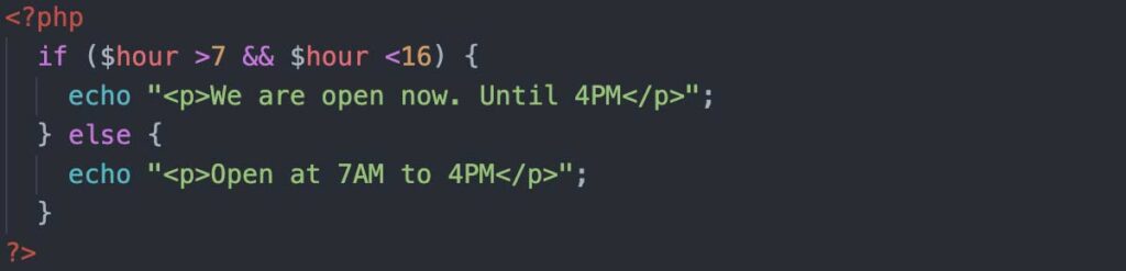
A sentence that changes over time
The first sentence of the home page will vary depending on the business hours. That is, it will indicate Open during business hours. Here is achieved with PHP. Because PHP requires less code than JavaScript, and I don’t have to worry about whether or not the client-side has JavaScript enabled.
Amendment of the year is no longer required for the copyright statement
It’s a simple line of code <?= date("Y"); ?>, which saves us from having to revise the copyright statement every year.
Application of jQuery
When I think about how to apply JavaScript/jQuery, I consider whether it can be used in meaningful places rather than pure movement. If a slideshow is used, more selling points can be displayed in the header of the home page. It also happens to be a function that my major project needs, so I can just practice first.
When JavaScript is disabled, the slideshow will stay on the last slide, which is a page without branding. So adding z-index code to ensures that the first branded slide is shown when there is no JavaScript.
Custom error page
The custom error page follows the original design style and colours, and there are clear instructions to direct the user to return to the correct page.
Check it out with xxx.php
Responsive image
In response to mobile users, responsive images are applied. The image’s width is reduced by 50%, and the size of the image can be reduced by about 60-70%. Especially since this website is mainly composed of images, this can greatly reduce data usage or speed up page loading speed.
CSS variables
Since the colour scheme has been decided and needs to be reused many times, I set variables for those colours. It is very convenient when I need to call the colour.
SEO
Keyword Location and Density
According to the consideration of keyword locations and density, some changes are made.
- rewrite for the <title> tag : swap the positions of the page title and the site title
- custom meta tag (description) for every page
- rewrite for the <h1> tag: change from “RICHARDSON’S” to “Traditional Bakery in Richmond”
- make sure there is a <h1> for every page
- increase the use of “Richmond” as a keyword, the word that indicates the location
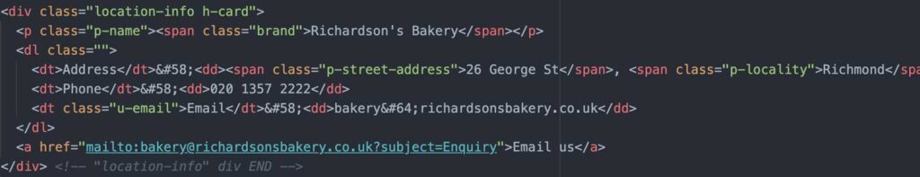
Microformats
Microformats are used on the Contact page.
In my case, I used h-card to represent the store, and its name, location, and contact information.
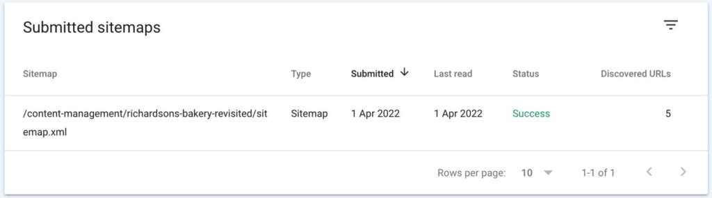
Sitemap.xml
Generated a sitemap XML page and then uploaded it to Google Search Console.
This might not help for a fictional business but just have a try.
Accessibility
Improvement of HTML semantics
- Used <address> for the contact information, and <dl> for the description of pair information, instead of <p> and <em>
- Rewrote the alternate text for all <img>
- Avoided the skipped heading level, rather than use different level of heading tag to indicate different styles
Skipnav
Skipnav has been applied to every page for skipping the navigation bar and the header.
Conclusion
Making a good website is really not easy. Not only can it be achieved technically or not, but also about how to attract users, provide them a good experience, readability, etc. Now I’m looking forward to making a website with real content, i.e., Major Project. Allow us to apply the knowledge and skills we have learned in the past six months. Of course, the learning journey continues.
References:
Book
Duckett, J. (2022). PHP & MYSQL: server-side web development. Wiley.
Websites
MA Web Design & Content Planning. (n.d.). Study web design in London at the University of Greenwich. [online] Available at: https://www.websitearchitecture.co.uk/ [Accessed 1 Apr. 2022].
MDN Web Docs. (n.d.). Responsive images. [online] Available at: https://developer.mozilla.org/en-US/docs/Learn/HTML/Multimedia_and_embedding/Responsive_images.
MDN Web Docs. (n.d.). Microformats. [online] Available at: https://developer.mozilla.org/en-US/docs/Web/HTML/microformats.
developer.mozilla.org. (n.d.). : The Description List element – HTML: HyperText Markup Language | MDN. [online] Available at: https://developer.mozilla.org/en-US/docs/Web/HTML/Element/dl [Accessed 1 Apr. 2022].
developer.mozilla.org. (n.d.). Custom properties (–*): CSS variables | MDN. [online] Available at: https://developer.mozilla.org/en-US/docs/Web/CSS/–*.
CSS-Tricks. (n.d.). Simple Auto-Playing Slideshow. [online] Available at: https://css-tricks.com/snippets/jquery/simple-auto-playing-slideshow/.